
Ever find yourself wondering what and how much research NIH supports near you? Check out what the modernized RePORTER site has to offer in three easy steps!
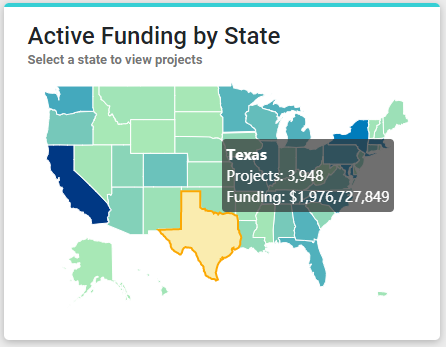
RePORTER’s main search page offers a new map visualization, highlighting active NIH projects by state. As first mentioned in this NIH Open Mike post from October, these maps are fast and interactive so you can dive into the results in your local area. Let’s take Texas as an example. Hovering your mouse cursor over the state, it shows 3,948 projects are active, totaling $1,976,727,849 in funding (Figure 1).
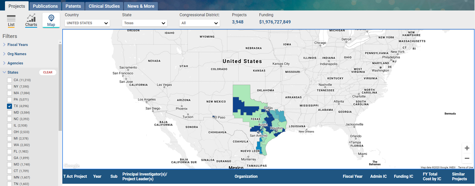
Going deeper, if you click on Texas, you can filter results for Congressional district, principal investigator, awardee organization, fiscal year, or administering NIH Institute(s) or Center(s). Darker colors (compared to lighter shaded areas) indicate more funding in that district (Figure 2).
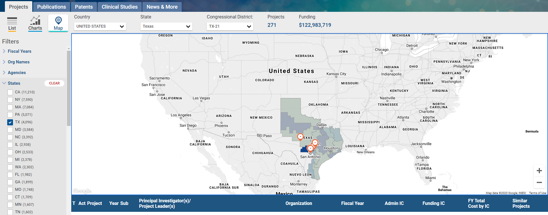
Focusing on central Texas, we can learn even more about its 21st Congressional district and the organizations NIH is supporting (Figure 3). From there, you can scroll down to read the project titles and learn more about individual projects.
0 Comments