
5 Comments
Many thanks for your terrific questions and comments to last month’s post, Research Commitment Index: A New Tool for Describing Grant Support. I’d like to use this opportunity to address a couple of key points brought up by a number of commenters; in later blogs, we’ll focus on other suggestions.
The two points I’d like to address here are:
- Why use log-transformed values when plotting output (annual weighted relative citation ratio, or annual RCR) against input (annual research commitment index, or annual RCI).
- What is meant by diminishing returns.
We use log-transformed values because scientific productivity measures follow a highly skewed, log-normal distribution. This is well described and therefore log-transformed plots are the norm in the literature (see here ![]() , here
, here ![]() , and here
, and here ![]() for examples).
for examples).
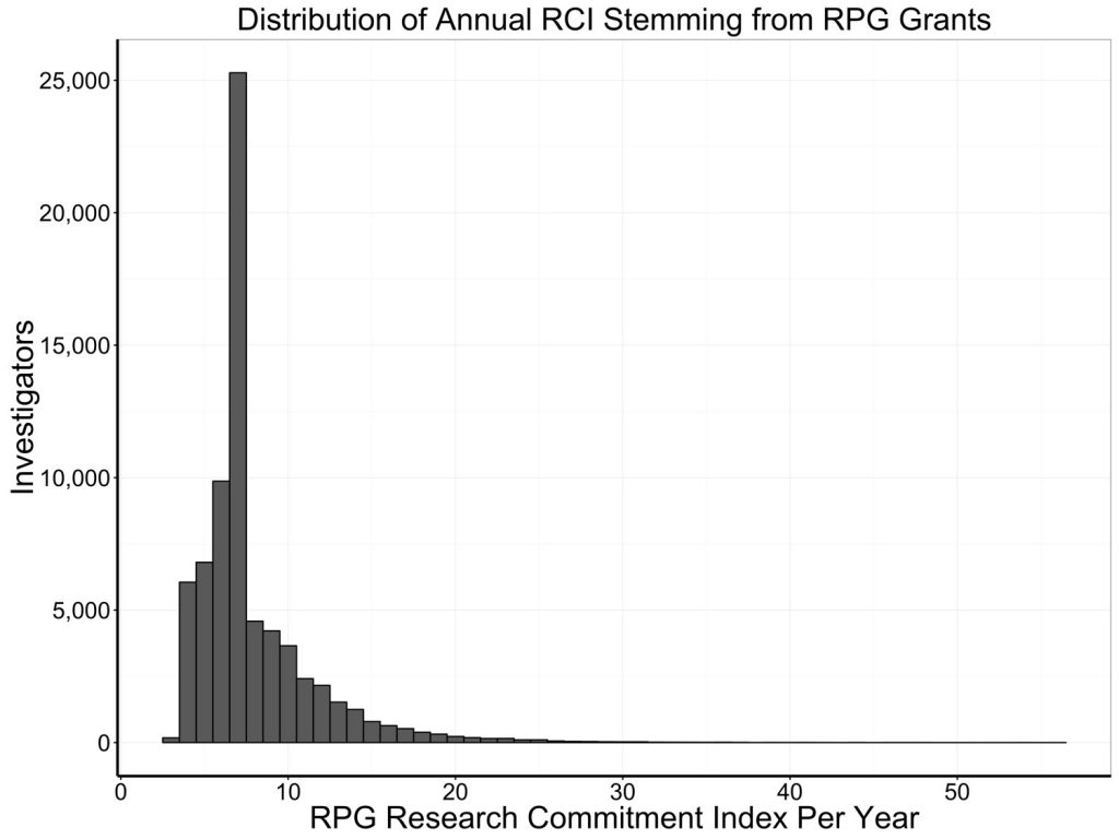
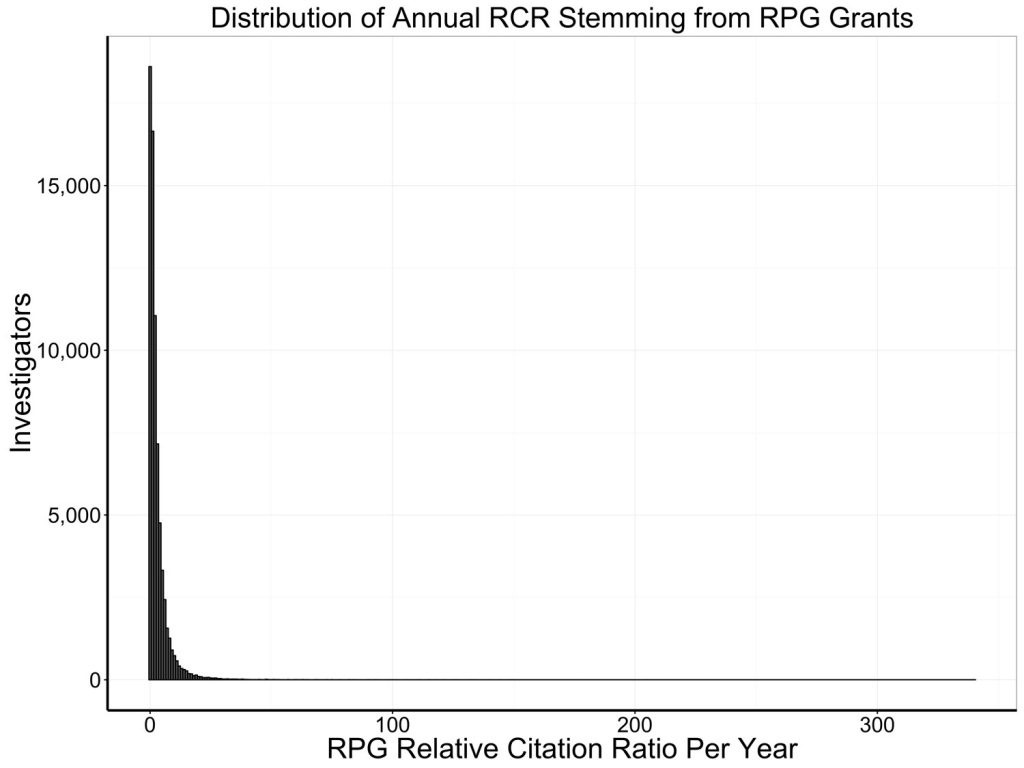
Figures 1 and 2 show the highly skewed distributions of annual RCI and annual weighted RCR in our sample of over 70,000 unique investigators who received at least one NIH research project grant (RPG) between 1995 and 2014.
When we and others ![]() refer to “diminishing returns,” what we mean is that we see diminishing marginal returns. Marginal returns are incremental returns on input associated with incremental increases in input. Mathematically, we talk about the slope (or more precisely first derivative) of the production plot that relates annual RCR to annual RCI.
refer to “diminishing returns,” what we mean is that we see diminishing marginal returns. Marginal returns are incremental returns on input associated with incremental increases in input. Mathematically, we talk about the slope (or more precisely first derivative) of the production plot that relates annual RCR to annual RCI.
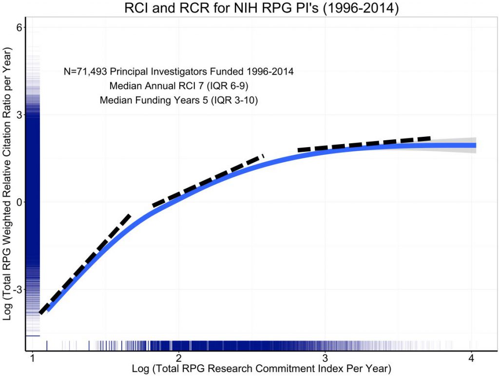
Figure 3 is the log-log plot; it is the same as the prior blog’s figure 5, except that the axis labels show log values. I’ve added dotted tangent lines that illustrate how the slope decreases at higher values of annual RCI.
Another way to visualize this is to look directly at marginal productivity, at how RCR changes compare in respect to changes in RCI – in other words, how the instantaneous slopes shown in Figure 3 (aka first derivative) change as RCI increases. Figure 4 shows the first derivative of the association of log annual RCR to log annual RCI with values of log annual RCI. As annual RCI increases, the marginal productivity decreases – this is what is meant by diminishing returns.
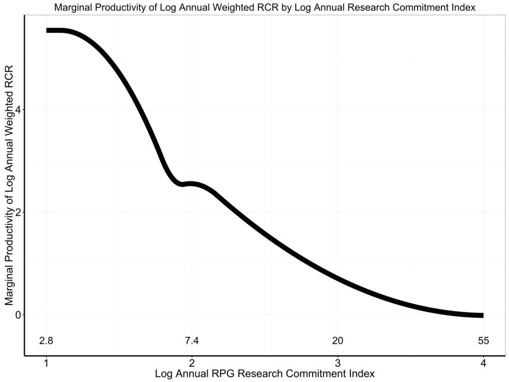
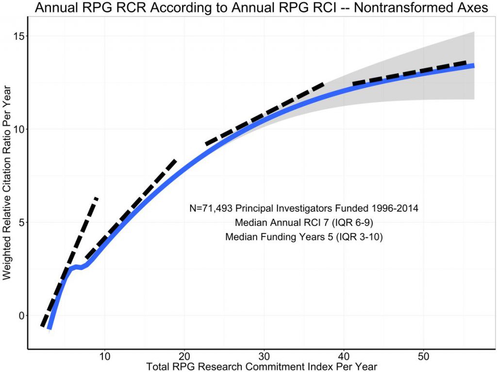
Figure 5 shows a non-transformed plot relating annual RCR to annual RCI. It’s technically incorrect – since both annual RCR and annual RCI follow highly skewed, log-normal distributions. Nonetheless, the dotted tangent lines show that the slope (marginal productivity) decreases with increasing RCI, again consistent with the phenomenon of diminishing marginal returns.
The phenomenon of diminishing returns is one that is well known across many fields of human endeavor. It’s important to recognize that diminishing returns does not mean negative returns. If we, as a funding agency, choose to increase funding to a laboratory, there is a high likelihood that the increased funding will lead to increased productivity. But the incremental increase in productivity may be less than the incremental increase in support ![]() ; if baseline funding is already high, the incremental returns may be less than if baseline funding is lower. Alberts and colleagues
; if baseline funding is already high, the incremental returns may be less than if baseline funding is lower. Alberts and colleagues ![]() pointed this out in their essay. Others from Canada
pointed this out in their essay. Others from Canada ![]() and Germany
and Germany ![]() have put forth similar arguments: funding agencies might maximize their impact by funding a larger, and more diverse, group of investigators with the limited resources available.
have put forth similar arguments: funding agencies might maximize their impact by funding a larger, and more diverse, group of investigators with the limited resources available.
Again, many thanks for your terrific comments. We look forward to addressing other points (including basic and clinical science and changes over time) in future posts.
Dear Dr. Lauer,
Thanks very much for sharing these analyses. I would like to offer a suggestion regarding the measure of productivity used, based upon my own experience.
Although basic research is the core focus of my lab, we also run a highly used database, which is funded by an R01, and are engaged in a U01-funded project that also has a service focus.
Our basic research generates a relatively large stream of publications, whereas the impact of the database project arises chiefly from user interactions with the database itself, rather than via our publications about the database; and something similar is true of the U01 project.
Measuring a lab’s productivity in terms of publications and citations means that the apparent output per dollar tends to be reduced by projects that contribute what is in effect infrastructure for the scientific community. I would not be surprised if this phenomenon contributes to some degree to the appearance of diminishing returns, as a number of researchers may take on a service oriented project once their research program is established.
Given that infrastructure and service projects can be important to the scientific community, I would suggest adjusting the measure of productivity to account for such contributions.
Thanks for your attention.
Sincerely,
Mike Gilson
Given that infrastructure and service projects can be important to the scientific community, I would suggest adjusting the measure of productivity to account for such contributions.
With all due respect, it is ironic that the NIH would target down-sizing the most successful scientists in order to improve the research enterprise. During my time on NIH Council, the “cap” guideline was not embraced by fellow investigators on even a single occasion. And the latest suggestions for RCI and RCR will not address the legendary problems with this approach, including the fact that review articles, which have no original data at all, routinely receive among the highest RCR scores.
But here I wish to highlight another significant development, which is the academic activity in drug discovery and development. Presumably the NIH considers the development of new therapeutics to be a high priority for health-related research, but I’m not sure that you’ve recognized that publication/citation is not a primary goal of drug discovery research. Indeed, it is common practice to avoid publication, except for patent protection, until the project is comfortably into clinical trials. Therefore, this key type of research would be penalized in the proposed citation-based system.
This situation provides yet another reason why research governance is best left to peer-review by highly qualified, active, and productive scientists. In short, scientists wish to let the research data, not administrative guidelines, provide for decision making. That is after all, why scientists became scientists. Accordingly, my suggestion would be to work instead on improving the peer review aspect of the funding process to insure that comprehensive review from the most competent scientists will be used to determine that the best research projects will be funded. If you need to embrace the latest proposed metrics, RCI, RCR, etc., use them to select (and reward) the best reviewers for peer decision making, and let the individual investigator’s data decide who/what is funded.
While I see the rationale for modeling the association between RCI and RCR with log-transformed RCR, I worry that the resulting shape of the curve may be misleading. A straight line in the association (constant slope) should be interpreted as a logarithmic INCREASE in productivity, and a down-bending curve may not actually represent diminishing returns, but a constant increase in productivity on the additive scale. Looks like several of commenters on your first article make the same point.
I still think your statistical approach is correct, but I would suggest that you model the impact of your proposed intervention (capping the RCI at 21, and redistributing the total RCI to, say, new investigators), and using your statistical model to estimate the total RCR output. This should give you a clearer interpretation of your findings and a better guess at how your proposed intervention might impact NIH’s scientific output (at least in terms of publications).
Given the problems with this analysis- namely the different scales on the X and Y axis, would you please publish the raw data?